Accent Wall Ideas: 12 Colors and Finishes, Tried on Real Rooms
Accent wall ideas you can see on real rooms: dark green, terracotta, limewash, wood slats, wallpaper and two-tone, plus how to pick the wall and paint it.
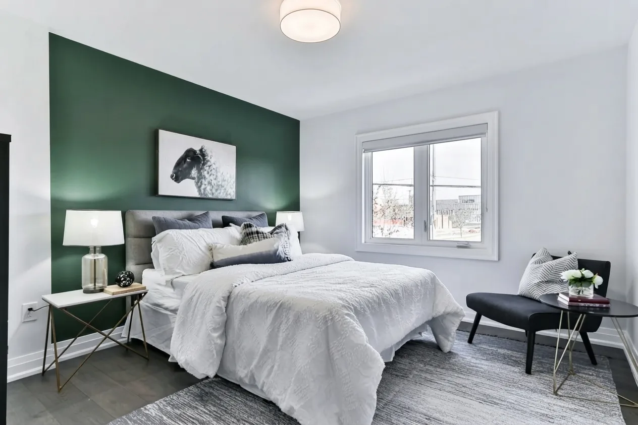
The best accent wall ideas are the simple ones: one wall, chosen because the room already looks at it, finished in a color or texture that is clearly deeper or richer than the walls around it. Deep green, terracotta, limewash, wood slats, a quiet wallpaper and a two-tone split cover most of what works today, and you’ll see each of them below on two real rooms rather than on a mood board.
Accent wall or feature wall, it’s the same idea. Ideas first, then which wall to choose, then how to paint it in a weekend.
Two real rooms, six walls
Every room image here is a Roomagine render of one of two photos: a white bedroom and a bright living room. Only the wall was meant to change, so you compare walls and nothing else. None of these finishes is one of the app’s 24 named styles; each is a custom prompt, quoted under the image. Custom prompts render one version at a time, so if a result is close but not right, reword it and run it again.
12 accent wall ideas
1. Deep forest green behind the bed
The image at the top of this page is the bedroom with the headboard wall in a matte forest green. It’s the easiest dark color to live with: green reads as calm rather than heavy, and white bedding, pale wood and brass all look better against it. The grey headboard and the black-and-white print suddenly have something to sit on.
If your bedroom gets little daylight, test green before navy. It tends to stay green in low light, where navy can drift toward black.
2. Terracotta for warmth
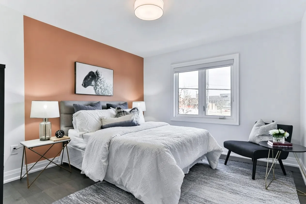
Custom prompt: “paint only the wall behind the headboard a warm terracotta clay colour in a matte finish, other walls stay white; keep the bed, bedding, nightstands, lamps, chair, rug, ceiling light, window, door and camera angle exactly as in the photo.”
Same room, very different mood. Terracotta warms a cool, grey-leaning room without making it feel themed. It works best when something small picks it up: a clay pot, a rust cushion. Here it carries the warmth alone, which is why it reads as a statement.
3. Limewash for texture without color
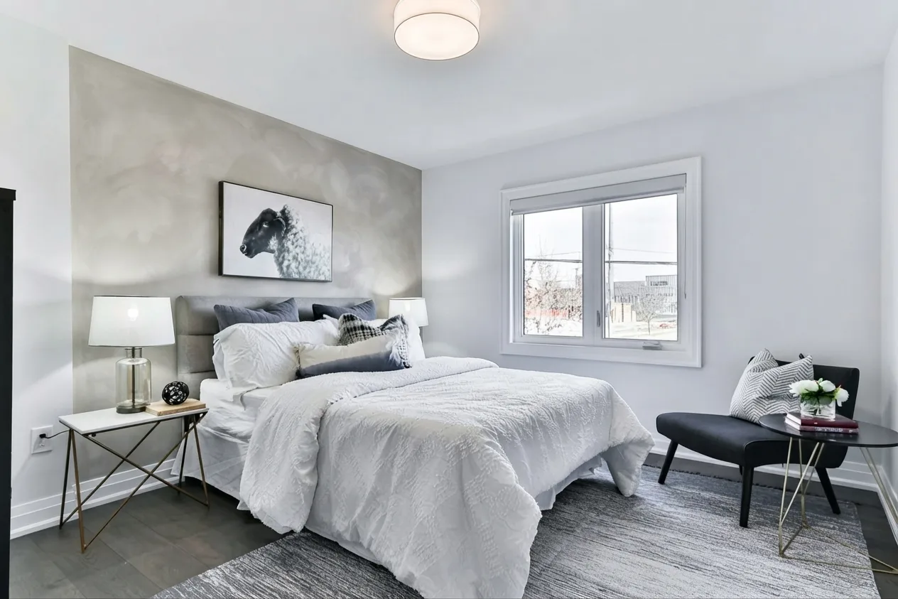
Custom prompt: “give only the wall behind the headboard a soft warm grey limewash finish with visible cloudy brush movement, other walls stay white; keep the bed, bedding, nightstands, lamps, chair, rug, ceiling light, window, door and camera angle exactly as in the photo.”
If you want an accent wall but not a strong color, use limewash. The cloudy movement gives the eye somewhere to land, and a pale warm grey forgives a slightly uneven wall. True limewash sticks best to porous surfaces, so painted drywall usually needs the maker’s recommended primer first.
4. Vertical wood slats
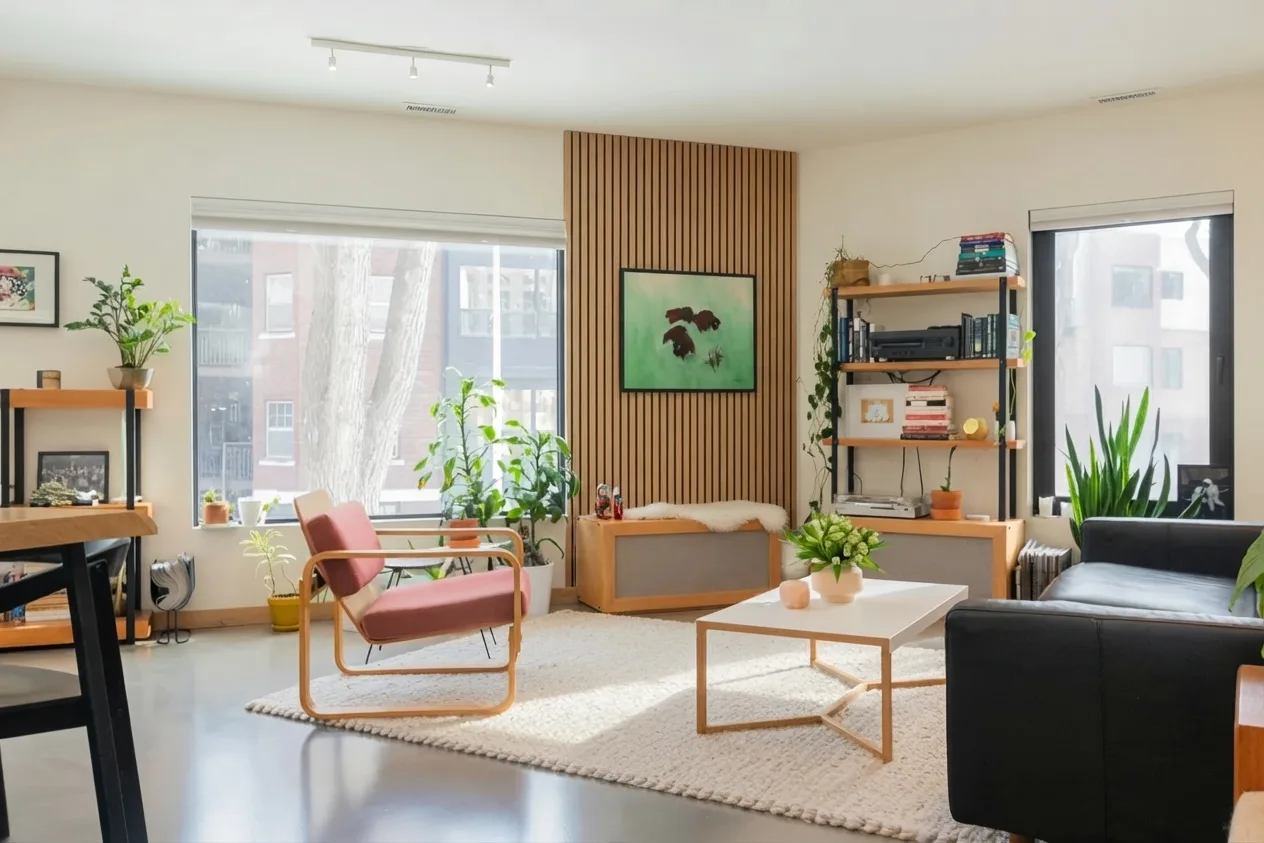
Custom prompt: “cover only the back wall between the two windows with vertical oak wood slats, other walls stay cream; keep the furniture, shelves, plants, rug, track lighting, both windows, doors and camera angle exactly as in the photo.”
The slats came back as a tall panel behind the art rather than the whole wall, which is a useful result: a panel this size is a far smaller DIY job and still frames the painting. Slats suit rooms that already have pale wood, like the shelving here.
5. A quiet botanical wallpaper
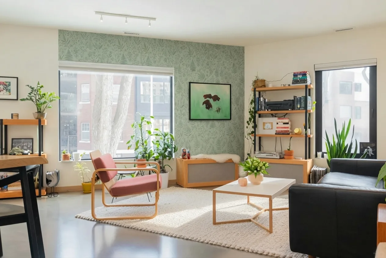
Custom prompt: “cover only the back wall between the two windows with a muted sage botanical wallpaper, other walls stay cream; keep the furniture, shelves, plants, rug, track lighting, both windows, doors and camera angle exactly as in the photo.”
Pattern on one wall is the classic way to try wallpaper without committing a whole room to it. Keep the pattern low-contrast if the wall also holds art, as this one does, or the two will fight. Renters can do this with peel-and-stick paper; our guide to removable wallpaper for apartments covers which kinds come off cleanly.
6. Two-tone: dark below, light above
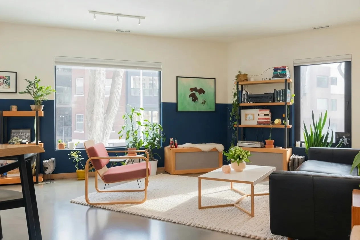
Custom prompt: “paint only the back wall between the two windows two-tone: deep navy on the lower half up to the window sills, cream above, with a crisp horizontal line; other walls stay cream; keep the furniture, shelves, plants, rug, track lighting, both windows, doors and camera angle exactly as in the photo.”
The model ran the navy around every wall in view, not just the one we asked for. It’s worth showing anyway: in an open room, a two-tone split reads more like a wainscot than an accent, and that can be the better call. For a true accent, stop the line at the corners of one wall. Either way, set the line at a height the room gives you, such as the window sills.
7. Inky navy in a room with good light
Navy is the dark color people reach for first, and it’s at its best in rooms with plenty of daylight and white or brass details. In a dim north-facing room, try it on a large sample board first.
8. Two or three shades deeper than the other walls
The most forgiving accent wall is the same color family as the rest of the room, just deeper. If your walls are a warm white, go to a mid greige; if they’re pale grey, go to a slate. It adds depth without anyone noticing a “feature.”
9. A painted arch behind the bed
An arch behind a headboard gives a plain bedroom a focal point without painting the whole wall. Draw the curve with a pencil on a pinned string.
10. Wide vertical stripes
Wide stripes in two close tones make a low ceiling feel taller. Measure and mark them before you tape, or they’ll lean.
11. Painted panel molding
Picture-frame molding painted the same color as the wall gives you texture through shadow rather than color. It suits older homes and traditional rooms, and looks deliberate even in a pale shade.
12. Blush or plaster pink
Muted pinks with a bit of brown in them sit somewhere between terracotta and neutral. They warm a north-facing room and flatter skin tones, which is one reason they keep turning up in bedrooms. For more combinations that work in a bedroom, see our guide to the best color schemes for bedrooms.
Which wall should be the accent wall
Ideas are the easy part. The wall you pick matters more than the color you put on it.
- The wall the room already faces. In a bedroom that’s almost always the wall behind the headboard, because it’s what you see from the door and what frames the bed. In a living room it’s the fireplace wall, the wall behind the sofa, or the wall the seating faces.
- A wall with no doors and few windows. A wall broken up by two doors and a window leaves only scraps of color. In the living room above, the wall between the windows works because it’s one clean panel.
- The wall your eye hits first. Stand in the doorway. The wall you look at without trying is your candidate.
- An architectural feature. An alcove, a chimney breast, or a sloped ceiling wall becomes intentional once it’s a different color.
One wall is the rule. Two accent walls usually look like you ran out of paint, unless the room gives you an obvious pair, such as alcoves either side of a chimney.
See it on your own wall first
A paint chip held against a white wall tells you little about how a whole wall will look behind your bed, under your light, next to your floor. The cheapest way to find out is to see it on a photo of your own room before you buy anything.
That’s what the renders above are. In Roomagine you take one photo of the room, type what you want the wall to become, and get your room back with that wall changed, in about ten seconds. Run three or four colors and you’ll usually know which one you’d regret. You can try one design in your browser at roomagine.ai/try without an account, or read how a paint color visualizer fits into choosing a color.
Then paint large swatches of the finalists on the wall and look at them morning and night. A render tells you whether the idea works; a swatch tells you whether that exact shade does.
How to paint an accent wall
You need a roller and frame, a medium-nap cover (thicker for textured walls), an angled brush for cutting in, painter’s tape, drop cloths, filler and a sanding block, and primer if the wall needs it.
Prep the wall
Most of a good finish is decided before the paint goes on.
- Clear and cover. Move furniture away from the wall and cover the floor. Tape drop cloths to the baseboard so drips can’t slide under.
- Clean. A damp sponge with a little mild soap removes the dust and grease that stop paint sticking. Let it dry fully.
- Fill and sand. Fill holes and cracks with spackle, slightly proud of the wall, since it shrinks as it dries. Once dry, sand flush with a fine-grit block until you can’t feel the patch, then wipe the dust off.
- Check for lead in older homes. If your home was built before 1978, the old paint may contain lead, and sanding it creates hazardous dust. The EPA’s guidance on lead-safe renovation and painting explains what to check before you sand.
- Prime when it matters. Prime if you’re going from dark to light or light to dark, painting over gloss, or painting over patched or new drywall. Otherwise, a good quality wall paint on a clean, sound surface usually doesn’t need it.
Choose the finish
- Matte or flat makes deep colors look richest and hides small flaws. It marks more easily, so it suits bedrooms and walls nobody leans on.
- Eggshell has a slight sheen, wipes clean better, and still hides most imperfections. It’s the safe choice for living rooms.
- Satin is more durable and reflects more light, which makes colors look a touch brighter and shows every bump in the wall.
For dark accent walls, stick to matte or eggshell.
Cut in, then roll
Run tape along the ceiling line and the adjacent walls if you don’t trust your hand. With the angled brush, paint a band about two to three inches wide along every edge of the wall: ceiling, corners, baseboard.
Then roll the middle while that border is still wet. Load the roller evenly, roll a large W shape, fill it in with straight vertical strokes without lifting, and move on, always overlapping the wet edge of the section before. Keeping a wet edge is what stops lap marks.
Two thin coats beat one thick one, which drips and dries unevenly. Let the first coat dry as long as the can says, then do the second, and pull the tape while it’s still slightly soft.
Open a window while you work and for a while after. Paint gives off volatile organic compounds as it dries; the EPA’s page on VOCs and indoor air quality explains why ventilation matters and what low-VOC labels mean.
Style it once it’s dry
A freshly painted wall looks unfinished until something sits against it.
- Pull the furniture back a few inches. A sofa or headboard pressed right against the wall makes the color look like a border. A small gap makes it a backdrop.
- Hang one large thing, not many small ones. A single big print or mirror holds a dark wall better than a gallery of frames.
- Light it in the evening. A lamp beside the wall brings the color out after dark.
If the accent wall is in a living room, our list of good living room paint colors helps you pick the color for the other walls so the two work together.
Questions people ask before painting
Should an accent wall be lighter or darker than the other walls?
Darker, in almost every case. A darker wall recedes slightly and draws the eye; a lighter one tends to look like the other walls need repainting. For a subtle look, go two or three shades deeper in the same color family.
What is the best accent wall color for a bedroom?
There’s no single best color, but deep green, warm terracotta and muted blush are reliable because they suit low evening light. Try your top two on a photo of your own room, then on a large swatch on the wall itself.
Pick the wall, then the color
Stand in the doorway, find the wall the room already looks at, and try your colors on a photo of it before you open a tin. Take one photo of your room in Roomagine on iOS or Android, describe the wall you want, and see it on your own room. Your first design is on us.